
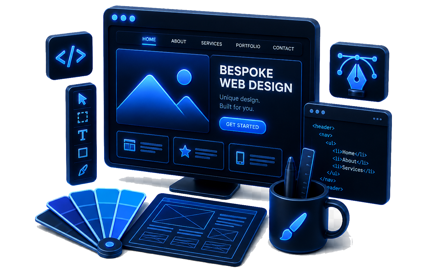
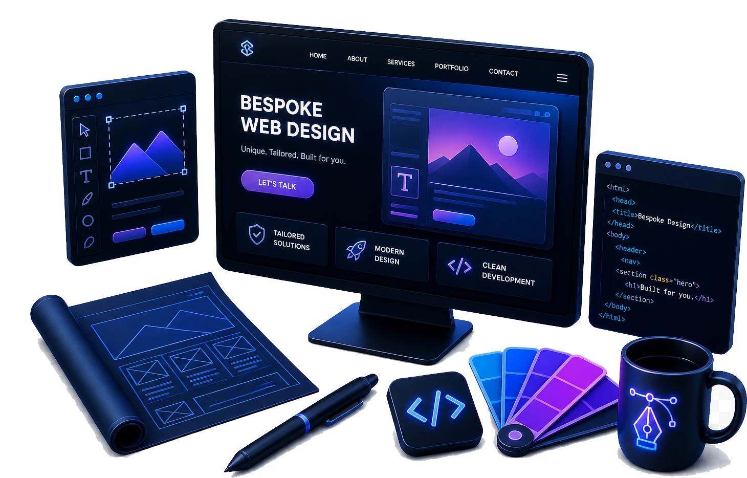
Component library
Buttons, cards, forms, tables, and hero variants specified for reuse across the site.
Bespoke web design means layouts, typography, and components built for your content, your conversion goals, and your engineering reality — so marketing looks premium and development stays sane.
Templates trade speed for sameness. Bespoke design trades ego for outcomes: clearer journeys, stronger hierarchy, and a visual language that fits your sector — without looking like every competitor running the same kit.
We start from your goals, audiences, and constraints — then design pages and components that belong to you: spacing, typography, interaction patterns, and breakpoints that support real copy and real journeys. The result is easier to extend, easier to explain to stakeholders, and easier for developers to implement without constant rework.
We wireframe and prototype where complexity demands it, then refine typography, spacing, and states until the interface feels calm and confident — fast to scan, hard to misuse, and respectful of motion and accessibility preferences.
Bespoke does not mean “non-repeatable.” We document components, tokens, and rules so your next page is cheaper than the last — and your developers spend less time reverse-engineering Figma.
Buttons, cards, forms, tables, and hero variants specified for reuse across the site.
Margins, gutters, and breakpoints expressed so CSS stays consistent in production.
Readable line lengths, heading levels, and responsive type ramps for marketing and app chrome.
Contrast, focus order, and semantic patterns baked in — not patched as an afterthought.
Modular sections and field guidance so editors cannot accidentally break the layout.
Clear annotations and changelogs so legal, product, and leadership sign-off stays painless.
You always know what we are designing, why we made that call, and what input we need from you to keep momentum.
We anchor the engagement in a shared brief and discovery pass: goals, audiences, existing analytics, and technical constraints (CMS, hosting, auth flows, third-party embeds). That keeps later design decisions traceable instead of subjective.
Wireframes and prototypes appear where complexity warrants them; we then move into visual design and a component system your team can extend. Handover includes structured exports, written specs, and pragmatic support through build and launch — so discovery, UX, visual design, system documentation, developer handover, and go-live stay visible and accountable end to end.
Deliverables flex per project, but bespoke web design typically includes the following baseline.
Share your goals, timelines, and stack. We will recommend a focused scope — from a high-impact marketing site to a deeper UI system — with pragmatic milestones.